Last few weeks/months i've produced some promo bits for Hop Monster Brewing Co, and its counter partner Georges Brewery. Including Beer fest tickets/illustrations, pump clips, and adverts.
Bit of a mish mash post but here we go:
Ticket artwork for Rochford Beer & ale Festival 2011:
This week i've mostly been working on the company website, see below at some illustrations i've produced and the rest of the site making, and producing new newspaper layouts for a estate agent in Hitchin who need a re-branding on their advertisements.
My boss said as the 'hand rendered' style illos worked so well on our website that i should include some on the re-brand of the newspaper adverts to give them a little more personality.
What with being super busy at work the past month and also busy on the freelance side of things, i've finally got round to making a small update.
This was an initial design for a flyer to get more people to bring donations to events a local hospice were holding, so people wouldn't have to take their unwanted bits to a charity shop, they could bring them to an event.
Still a work in progress but i thought i'd do a brief update on what i've been working on at the moment, amongst a lot of other things, but i can't upload those yet as they're in process of going to print. Very excited to see the finished product!
First thoughts on a re-brand. Here's what they have at the moment. They want to stay with the blue colour scheme, and suggested they same colours as the Travel Lodge brand. Heres what i'm initally thinking...
I can't help thinking that this reminds me of something i've already seen.. anyone else?
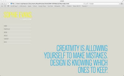
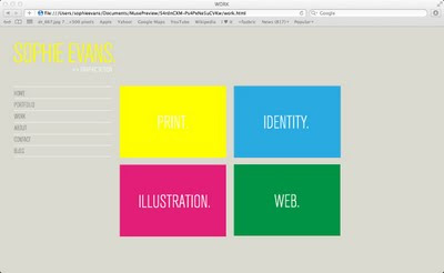
..so i thought i'd take the opportunity to have a play around a bit with dreamweaver and give it a fresh lick of paint. Plus my shitty host one.com (whom i wouldn't recommend to anyone) wanted to charge me £30 for my second year of hosting with their auto renewal rubbish when my first year was only £10. Not a chance sunshine..
Anyway here's a few screenshots of my work in progress... (click for larger image) Thought i'd try and make it a little more shiny than the last one, so have made image rollovers to entertain.
So as i mentioned in the previous post and showed you a small part of the wall graphic ideas for our office heres a bigger picture of one of the ideas.
The white out lines are obviously a white board on our wall and a heater....
I mentioned a couple of posts ago that i designed a logo for a new pet care service, well heres a design as requested by the client for a half van wrap.