So it's been a whole year (and a little bit more since i've posted on my blog) i've been a busy bee and managed to score a new job at Boden, as a Junior online designer, i've now been here for a year.
I've worked on a wide range of creative marketing for the brand. From creating product stories and concepts for online features and rich-media content, designing seasonal brand inserts and online lookbooks, creating digital assets for promotions, social, affiliate banners, email marketing campaigns and the day to day site maintenance, (homepage and department pages updates).
More recently our two teams (online and print) have merged into one, so i've also been tackling more print based work again, recently i've been working on a 16pp catalogue replacement piece which aims to drive sales and traffic back to boden.co.uk.
But heres a feature I designed (and drew all the little animations) that i'm super proud of, it also got a small bit of attention in the media which is quite cool.
You can view it live here: http://www.boden.co.uk/en-GB/magazine/features/mini-meet-and-greet.html#main
And read about it here on the Daily Mail or the Telegraph
Showing posts with label graphic design. Show all posts
Friday, 18 April 2014
An update.
Labels:
boden mini feature,
boden.co.uk,
digital design,
graphic design,
Holly Greenhow,
online designer.
Thursday, 31 January 2013
The Return of
Labels:
Brighton northern soul,
club flyer.,
event poster design,
graphic design,
Northern Soul poster design,
reggae poster design,
southend graphic design,
southend on sea,
typography
Wednesday, 28 November 2012
Tri-fold leaflets are SO '96
Received some great feedback from the client on the ProLift logo re-design and was asked to re-design that hideous leaflet I included in the post before this.
I HATE tri-fold leaflets. I don't know why but they always seem kind of dated to me, just gathering dust in those doctors surgery waiting rooms. So I took this as an opportunity to try and change my own opinion and bring some life back into the tri fold leaflet.
(click for a bigger view!)
I HATE tri-fold leaflets. I don't know why but they always seem kind of dated to me, just gathering dust in those doctors surgery waiting rooms. So I took this as an opportunity to try and change my own opinion and bring some life back into the tri fold leaflet.
(click for a bigger view!)
Labels:
againstsoph,
booklet design,
DL leaflet,
graphic design,
re-brand,
rebrand,
southend graphic design,
southend logo design,
trifold leaflet design. tri fold leaflet design
Monday, 19 November 2012
It's been a busy few weeks!
I STILL need to get round to photographing Sisters Avenue Brochure for not only blogging about but my new digital portfolio and website that i've spent the last few months working on, inbetween my day job, exercising and living! But its coming together slowly but surely. I'm aiming to get it up and running by the end of November/the end of the year.
But until then, here's a little re-brand i've been working on. ProLift.
Here's what they were using before, a hideous clipart shape teamed with a weird marble effect. yucky.


Heres what i'm thinking; a simple, versatile logo.
But until then, here's a little re-brand i've been working on. ProLift.
Here's what they were using before, a hideous clipart shape teamed with a weird marble effect. yucky.


Heres what i'm thinking; a simple, versatile logo.
Labels:
graphic design,
logo design,
re-brand,
southend graphic design,
southend logo design,
southend on sea
Thursday, 1 November 2012
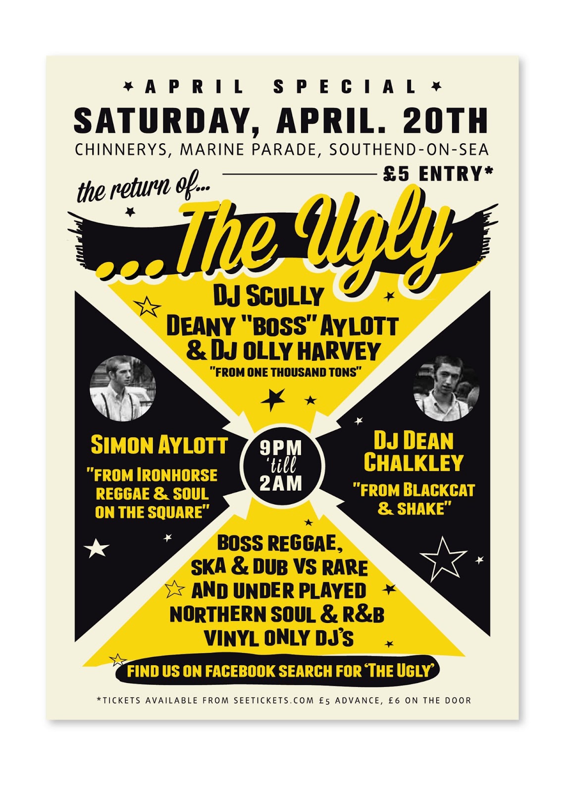
Return of the Ugly
Not just the return of me! But a poster i completed a few months back that didn't end up getting used for the event. I really liked this piece so i thought i'd share it with whomever reads this!
I've got a few bits i've got to blog about from my day job, some really nice high spec brochures and that, just gotta wait for the final thing to come back from our printers!
Labels:
againstsoph,
brighton events july,
Brighton northern soul,
club flyer.,
event poster design,
graphic design,
Northern Soul poster design,
prince albert poster,
return of the ugly,
rocksteady poster
Wednesday, 10 October 2012
It's gone to print...
I created the brand for this development in Clapham back in June i think, and we've finally got the approval to go to print with it from the client. I'm SO excited to see the final thing. Foiled logo with a special printed on a velvet/soft touch stock, hardback, casebound. Print geek alert!
Heres some spreads from the brochure.
I created everything from the brand to typographic layout and even the map (i'm slowly enjoying creating these!)
(click to view larger!)
Heres some spreads from the brochure.
I created everything from the brand to typographic layout and even the map (i'm slowly enjoying creating these!)
(click to view larger!)
Labels:
againstsoph,
brochure design,
clapham london brochure,
development brochure design,
graphic design,
london development brochure design
Monday, 20 August 2012
Branding - 'Ceh'
I started this project for a guy that approached me on twitter to have a look at branding himself as 'ceh'. He was a web developer/designer and coded CSS/HTML. Unfortunately on my part, due to bad timing and work commitments overload this never got finished. Which is a shame, as i enjoyed working on it.
I tried to bring in a little bit of code, design and his personality to the logo.
Different colour options;
I tried to bring in a little bit of code, design and his personality to the logo.
Different colour options;
Labels:
essex logo design,
graphic design,
logo design,
web designer logo design.,
web developer logo design
Friday, 17 August 2012
Logo concept
So i haven't totally abandoned this blog! Its been hectic at work of late and also i've been blogging a lot more on my boring life, mostly dieting and stuff over on riots and diets (there a link over on the right hand side if you wanted to see.
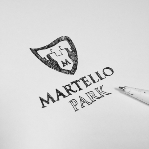
This was a logo that didn't get chosen for a housing development in Felixstowe. Which i'm actually currently working on a hoarding design for, which i'll upload in a few days after i've worked on it some more. But i liked it, so i thought i'd share it.
Heres an initial sketch.
This was a logo that didn't get chosen for a housing development in Felixstowe. Which i'm actually currently working on a hoarding design for, which i'll upload in a few days after i've worked on it some more. But i liked it, so i thought i'd share it.
Heres an initial sketch.
And heres the vectorised product.
Labels:
againstsoph,
development logo design,
graphic design,
logo design,
southend graphic design,
southend logo design
Wednesday, 18 July 2012
unused logo concept
This wasn't chosen to put infont of the client, but i still like it.
This was for a (redesign) logo design for a local development in Hawkwell, Essex.
Labels:
againstsoph,
awesome,
essex logo design,
graphic design,
hawkwell essex,
logo design,
property logo,
southend graphic design,
southend logo design
Tuesday, 3 July 2012
Hip City Cats Flyer
So i got asked again to do this months flyer for Brightons biggest northern soul night, Hip City Cats at the Jive Monkey. I designed another retro/vintage poster / double sided flyer. I'm in love with all of these typefaces at the moment, so it was a pleasure that i could use them all AT THE SAME TIME. (which is totally not supposed to work in the world of design, but this does)
Anyway. Here it is.
Anyway. Here it is.
Labels:
againstsoph,
Brighton northern soul,
club flyer.,
dj scully,
essex design,
event poster design,
graphic design,
Hip City Cats,
leaflet design,
logo design,
poster design,
print,
the jive monkey
Monday, 2 July 2012
It's July, where has the time gone?!
I've been a busy bee these past few weeks, both in and outside of work, freelance and personal stuffs.
It's all good though, better being super busy than to be super bored!
Here's a logo i've been working on at work, for a small (think there's only 15 being built) new housing development in Clapham, London. Specification of these properties are very high.
Still in the early stages, but i'm going to be working on putting together a brochure for these properties, the brochure will include embossing, foiling, metallics etc. Lavveelllyyy.
It's all good though, better being super busy than to be super bored!
Here's a logo i've been working on at work, for a small (think there's only 15 being built) new housing development in Clapham, London. Specification of these properties are very high.
Still in the early stages, but i'm going to be working on putting together a brochure for these properties, the brochure will include embossing, foiling, metallics etc. Lavveelllyyy.
Labels:
againstsoph,
brochure design,
graphic design,
logo design,
print,
saweet,
updates
Tuesday, 22 May 2012
Picnic's leaflet
I just want to start and say that the logo on this leaflet was what the client has used for the last 10 years or so, so i didn't have a choice but to use it! (it makes my eyes bleed a little)
Anyway, just a small update with a fairly quickly produced leaflet for a local business.
Labels:
childrens caterer,
childrens food,
graphic design,
kids food delivery,
kids leaflet design,
leaflet design
Thursday, 10 May 2012
It FINALLY launched!
So after what seems like forever of designing and building our company website, today, it finally found its new home on the internet.
You can view it by clicking here.
Here are some screenshots;
Labels:
encompasscreative,
graphic design,
web design
Monday, 13 February 2012
I haven't posted in a while so heres
Labels:
graphic design,
logo design,
one shot movie
Friday, 18 November 2011
Its been a whole month since i've posted.
What with being super busy at work the past month and also busy on the freelance side of things, i've finally got round to making a small update.
This was an initial design for a flyer to get more people to bring donations to events a local hospice were holding, so people wouldn't have to take their unwanted bits to a charity shop, they could bring them to an event.


This was an initial design for a flyer to get more people to bring donations to events a local hospice were holding, so people wouldn't have to take their unwanted bits to a charity shop, they could bring them to an event.


Labels:
autumn flyer,
flyer,
graphic design,
Hospices,
illustration
Tuesday, 18 October 2011
Just got these back...
Labels:
DL leaflet,
graphic design,
leaflet design,
storage
Wednesday, 7 September 2011
my websites gone down..
..so i thought i'd take the opportunity to have a play around a bit with dreamweaver and give it a fresh lick of paint. Plus my shitty host one.com (whom i wouldn't recommend to anyone) wanted to charge me £30 for my second year of hosting with their auto renewal rubbish when my first year was only £10.
Not a chance sunshine..
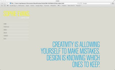
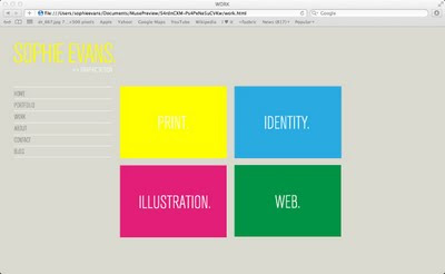
Anyway here's a few screenshots of my work in progress... (click for larger image)


Thought i'd try and make it a little more shiny than the last one, so have made image rollovers to entertain.
Not a chance sunshine..
Anyway here's a few screenshots of my work in progress... (click for larger image)
Thought i'd try and make it a little more shiny than the last one, so have made image rollovers to entertain.
Labels:
graphic design,
personal,
re-brand,
web design
Tuesday, 29 June 2010
Clear
Today I went to pick up the perspex for the front off my boxes.
I'm really pleased with the overall look, it's just setting up the scenes now ready for New Designers in a couple of weeks!
The last in the Graduate shows.


I'm really pleased with the overall look, it's just setting up the scenes now ready for New Designers in a couple of weeks!
The last in the Graduate shows.
Labels:
Boxes,
graphic design,
paper scultpture,
wooden
Saturday, 26 June 2010
D&AD New Blood (Friday 25th June)
Yesterday I went along to man the stand at D&AD's New Blood exhibition.
Minus the temperature in there (felt like a million degrees!) it was a really exciting evening.
We had a ton of interest in our stand and a lot of industry people visited.


Minus the temperature in there (felt like a million degrees!) it was a really exciting evening.
We had a ton of interest in our stand and a lot of industry people visited.
Labels:
D+AD,
graduate show,
graphic design,
Truman Brewery
Subscribe to:
Posts (Atom)