Received some great feedback from the client on the ProLift logo re-design and was asked to re-design that hideous leaflet I included in the post before this.
I HATE tri-fold leaflets. I don't know why but they always seem kind of dated to me, just gathering dust in those doctors surgery waiting rooms. So I took this as an opportunity to try and change my own opinion and bring some life back into the tri fold leaflet.
(click for a bigger view!)
Showing posts with label re-brand. Show all posts
Wednesday, 28 November 2012
Tri-fold leaflets are SO '96
Labels:
againstsoph,
booklet design,
DL leaflet,
graphic design,
re-brand,
rebrand,
southend graphic design,
southend logo design,
trifold leaflet design. tri fold leaflet design
Monday, 19 November 2012
It's been a busy few weeks!
I STILL need to get round to photographing Sisters Avenue Brochure for not only blogging about but my new digital portfolio and website that i've spent the last few months working on, inbetween my day job, exercising and living! But its coming together slowly but surely. I'm aiming to get it up and running by the end of November/the end of the year.
But until then, here's a little re-brand i've been working on. ProLift.
Here's what they were using before, a hideous clipart shape teamed with a weird marble effect. yucky.


Heres what i'm thinking; a simple, versatile logo.
But until then, here's a little re-brand i've been working on. ProLift.
Here's what they were using before, a hideous clipart shape teamed with a weird marble effect. yucky.


Heres what i'm thinking; a simple, versatile logo.
Labels:
graphic design,
logo design,
re-brand,
southend graphic design,
southend logo design,
southend on sea
Friday, 2 December 2011
a December update, of small proportions
This week i've mostly been working on the company website, see below at some illustrations i've produced and the rest of the site making, and producing new newspaper layouts for a estate agent in Hitchin who need a re-branding on their advertisements.
My boss said as the 'hand rendered' style illos worked so well on our website that i should include some on the re-brand of the newspaper adverts to give them a little more personality.
Here's a couple of them.

My boss said as the 'hand rendered' style illos worked so well on our website that i should include some on the re-brand of the newspaper adverts to give them a little more personality.
Here's a couple of them.

Tuesday, 11 October 2011
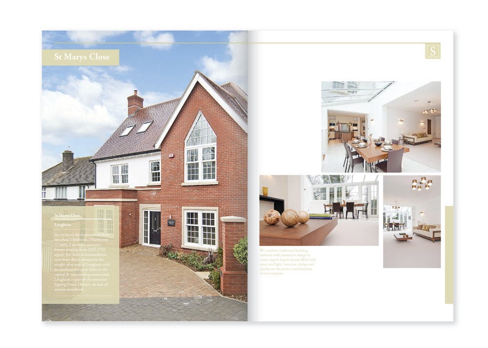
Re-branding and brochure design..
Still a work in progress but i thought i'd do a brief update on what i've been working on at the moment, amongst a lot of other things, but i can't upload those yet as they're in process of going to print. Very excited to see the finished product!
But heres an initial though on another re-brand.


But heres an initial though on another re-brand.


Monday, 12 September 2011
Initial ideas on a re-brand
First thoughts on a re-brand.
Here's what they have at the moment.

They want to stay with the blue colour scheme, and suggested they same colours as the Travel Lodge brand. Heres what i'm initally thinking...


I can't help thinking that this reminds me of something i've already seen.. anyone else?
Here's what they have at the moment.

They want to stay with the blue colour scheme, and suggested they same colours as the Travel Lodge brand. Heres what i'm initally thinking...


I can't help thinking that this reminds me of something i've already seen.. anyone else?
Labels:
essex,
estate agents rebrand,
logo design,
re-brand
Wednesday, 7 September 2011
my websites gone down..
..so i thought i'd take the opportunity to have a play around a bit with dreamweaver and give it a fresh lick of paint. Plus my shitty host one.com (whom i wouldn't recommend to anyone) wanted to charge me £30 for my second year of hosting with their auto renewal rubbish when my first year was only £10.
Not a chance sunshine..
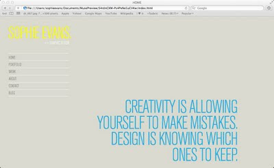
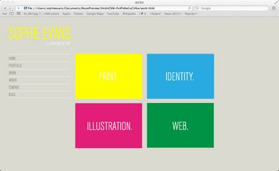
Anyway here's a few screenshots of my work in progress... (click for larger image)


Thought i'd try and make it a little more shiny than the last one, so have made image rollovers to entertain.
Not a chance sunshine..
Anyway here's a few screenshots of my work in progress... (click for larger image)
Thought i'd try and make it a little more shiny than the last one, so have made image rollovers to entertain.
Labels:
graphic design,
personal,
re-brand,
web design
Thursday, 9 June 2011
Another website rebrand proposal
Have been a very busy bee at work of late with web design stuffs.
Heres the latest site i've been re-working.
Before;

After;
Heres the latest site i've been re-working.
Before;
After;
Subscribe to:
Posts (Atom)