Received some great feedback from the client on the ProLift logo re-design and was asked to re-design that hideous leaflet I included in the post before this.
I HATE tri-fold leaflets. I don't know why but they always seem kind of dated to me, just gathering dust in those doctors surgery waiting rooms. So I took this as an opportunity to try and change my own opinion and bring some life back into the tri fold leaflet.
(click for a bigger view!)
Showing posts with label southend logo design. Show all posts
Wednesday, 28 November 2012
Tri-fold leaflets are SO '96
Labels:
againstsoph,
booklet design,
DL leaflet,
graphic design,
re-brand,
rebrand,
southend graphic design,
southend logo design,
trifold leaflet design. tri fold leaflet design
Monday, 19 November 2012
It's been a busy few weeks!
I STILL need to get round to photographing Sisters Avenue Brochure for not only blogging about but my new digital portfolio and website that i've spent the last few months working on, inbetween my day job, exercising and living! But its coming together slowly but surely. I'm aiming to get it up and running by the end of November/the end of the year.
But until then, here's a little re-brand i've been working on. ProLift.
Here's what they were using before, a hideous clipart shape teamed with a weird marble effect. yucky.


Heres what i'm thinking; a simple, versatile logo.
But until then, here's a little re-brand i've been working on. ProLift.
Here's what they were using before, a hideous clipart shape teamed with a weird marble effect. yucky.


Heres what i'm thinking; a simple, versatile logo.
Labels:
graphic design,
logo design,
re-brand,
southend graphic design,
southend logo design,
southend on sea
Friday, 17 August 2012
Logo concept
So i haven't totally abandoned this blog! Its been hectic at work of late and also i've been blogging a lot more on my boring life, mostly dieting and stuff over on riots and diets (there a link over on the right hand side if you wanted to see.
This was a logo that didn't get chosen for a housing development in Felixstowe. Which i'm actually currently working on a hoarding design for, which i'll upload in a few days after i've worked on it some more. But i liked it, so i thought i'd share it.
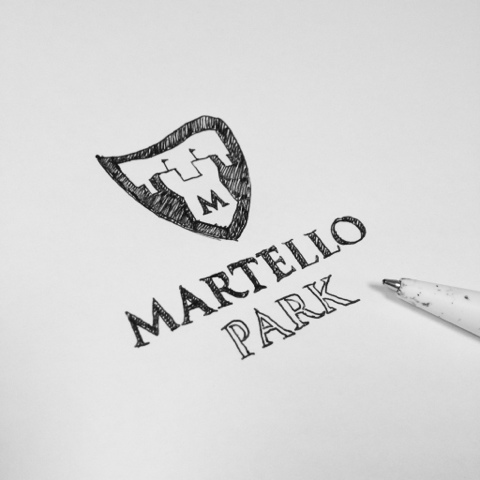
Heres an initial sketch.
This was a logo that didn't get chosen for a housing development in Felixstowe. Which i'm actually currently working on a hoarding design for, which i'll upload in a few days after i've worked on it some more. But i liked it, so i thought i'd share it.
Heres an initial sketch.
And heres the vectorised product.
Labels:
againstsoph,
development logo design,
graphic design,
logo design,
southend graphic design,
southend logo design
Wednesday, 18 July 2012
unused logo concept
This wasn't chosen to put infont of the client, but i still like it.
This was for a (redesign) logo design for a local development in Hawkwell, Essex.
Labels:
againstsoph,
awesome,
essex logo design,
graphic design,
hawkwell essex,
logo design,
property logo,
southend graphic design,
southend logo design
Subscribe to:
Posts (Atom)